Dealing with GTFS fallacies
by multimob — written on 2023-10-10
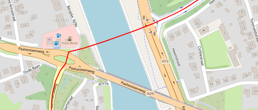
Here is a new gem here, for a bus route in Beringen. In this area, the OSM basemap matches reality very accurately, while the red line drawn on top is directly taken from De Lijn GTFS data. If we follow GTFS data, the bus flies above water to get to the other riverbank.
This is a fairly common example of incorrect data one finds when using GTFS data. Every such discrepancy requires spending some time analysing the situation on the ground and guessing what a logical itinerary would be.
The location of stops is also something one should never take at face value, as it has been already explained on other articles.
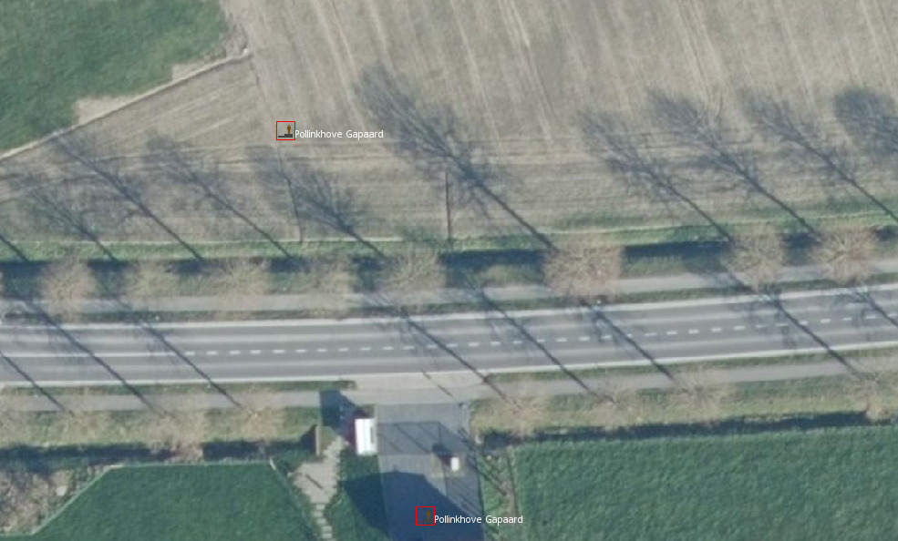
GTFS data locates the stops below in the middle of fields or on courtyards. Definitely not, the stop posts are next to the road.
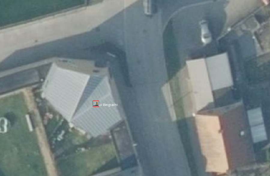
Below is one of the most common issues: applying the lat/lon values directly into OSM would imply that the bus stop is inside a house. This requires manual intervention to get the node closer to the road. With a first question for the mapper: should the stop be moved along the horizontal road, along the vertical road or on the corner itself?
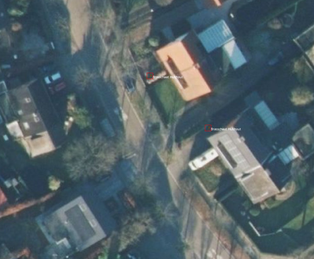
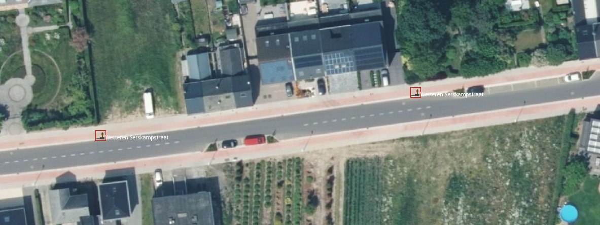
Alignment problems are very common too, as the next picture shows. Operators sometimes use their own basemap and locate bus stops left and right of the road. The problem happens if they use a basemap where roads are not calibrated properly. On this picture, it looks like both stops are on the same side of the road. As one says, shift happens.
Finally one example with trams. On this tram stations, there are 3 tracks, parallel to each other, each having a single stop node. Yet, the operator’s data shows a rather different situation. A lot of time is spent looking at every node in detail to try to figure out which location should go where. And yes, the node on the left is supposed to be a tram stop.
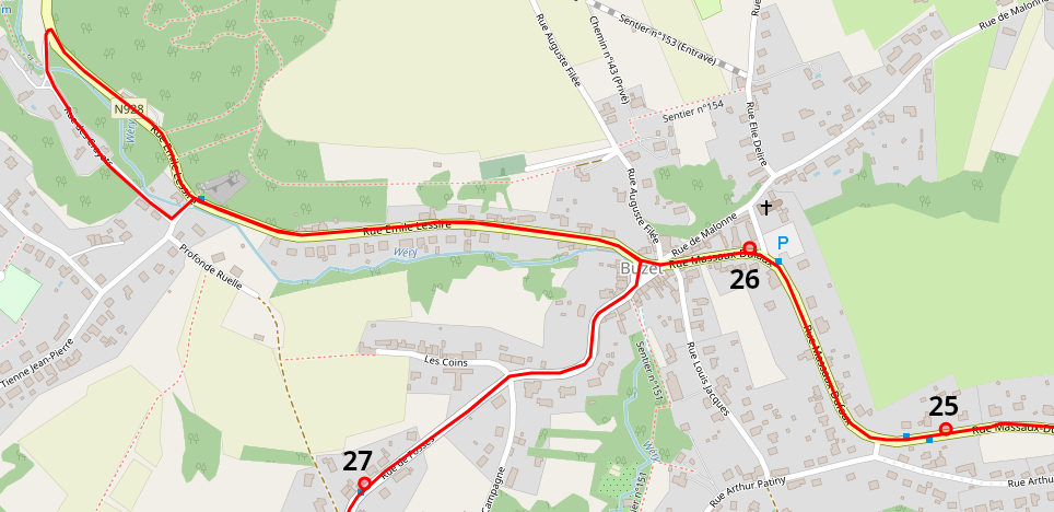
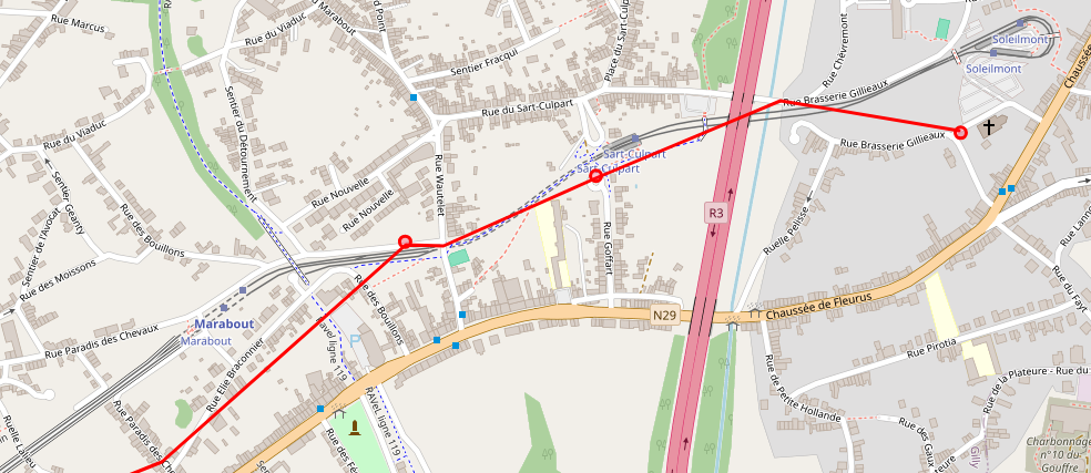
Below is the itinerary of a bus route near Namur. Observe the loop between stops 26 and 27: that loop used to be there to serve a neighbourhood but the stop isn't there anymore. Nowadays, buses go straight ahead on the main road, yet GTFS data still shows the itinerary as if every bus would still do this entire loop for nothing.
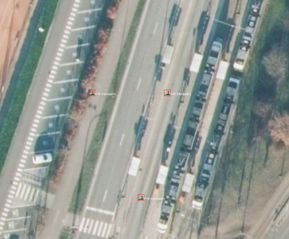
On the following picture, the two stops are exactly on the same side of the road. They have a different unique code, so you need to inspect the stop sequence in the timetables to know which of them should be moved further south.
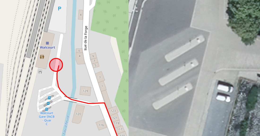
There is a beautiful bus station in Walcourt, with 3 platforms. Aerial imagery confirms the bus station is there, and on higher zoom levels we can even see the shadows of the stop posts. If we were to map according to GTFS data, not only there would be a single stop but it would be on a totally different location, as if this bus station had never existed.
We should never assume that operators are stupid or "just don't know the infrastructure they run". Of course, as a whole, the operator is usually perfectly knowledgeable. But transport companies are usually large firms with several departments and not everyone knows everything, as those plots of GTFS data for Charleroi underground tram lines show.
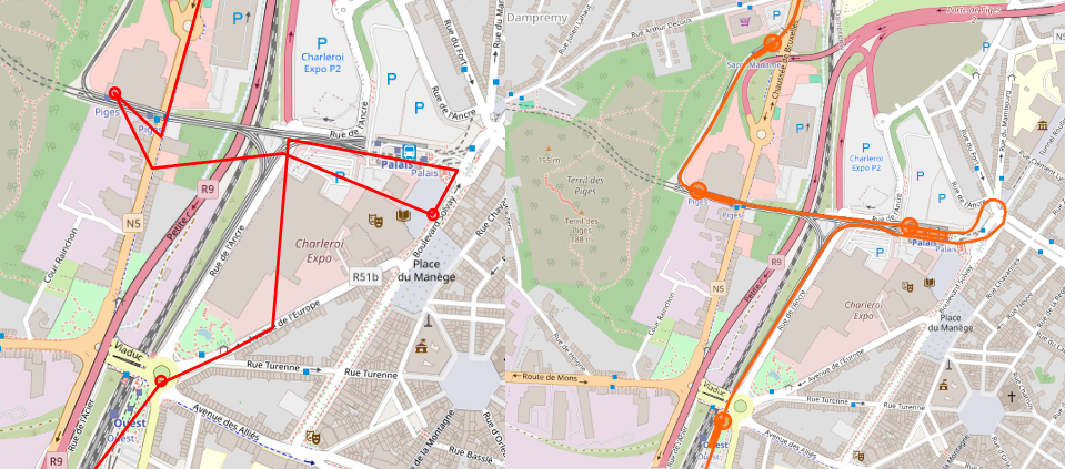
We usually suspect that the internal cartography systems used by operators, which are used to build GTFS data, do not need perfect accuracy, and this is why they will sometimes grossly simplify geometries. This screenshot for Charleroi tram route M3 across Palais station (formerly Beaux-Arts) shows how they drew the itinerary, compared with what we think is a perfectly accurate version, used in OSM.
This is also a lesson because, apart from comparing the location of stops (which can be trivial because it’s mostly about comparing single points with each other) the next challenge in quality monitoring would be to ensure that itineraries in OSM match GTFS data as much as possible, possibly by measuring the distance travelled between stops or a sort of correlation between shapes. This will inevitably provide lots of false positives with cases like those.
Permalink: https://blog.multimob.be/zzaighu9th.htm